Color and Light
Chapter 4 - Elements of Color
Rethinking the Color Wheel
Light is bent or refracted and wrapped around a circle to create a color wheel.

Primaries: red, yellow, blue.
Secondaries: green, orange, violet.
Complements: blue and orange, yellow and violet, red and green.
Traditional Wheel vs other ideas:
- Traditional has a few problems mostly regarding the use of the terms "primary" and "secondary."
- YURMBY wheel uses six equal primaries: yellow, red, magenta, blue, cyan, and green.
Chroma and Value
Color can be defined in terms of two dimensions:
hue - where it appears around the edge of the color wheel, and
chroma - how pure or grayed-down it appears.
A third dimension to consider for
color mixture, is the
value or lightness.
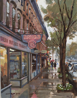
Local Color
Local color is the color of the surface of an object as it appears close up in white light.
When painting local color, however, making modifications to the colors you mix will result in the colors being slightly different.

Grays and Neutrals
Grays or neutrals are the opposite of intense colors.
Grays and neutrals are an artist's best friend.
- They provide a settings for bright color accents.
- Mix grays from blue and orange, red and green, or violet and yellow. Placing these color accents near the gray will harmonize.
- Gray is the sauce of the color scheme.

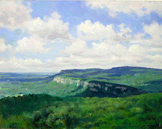
The Green Problem
Tips For Handling Green:
1. Mix greens only from various blues and yellows. The result is weaker and more varied, both qualities you want.
2. Avoid monotony. Vary mixtures of greens at both the small and large scale.
3. Mix a supply of ping or reddish gray and weave it in and out of the greens.
4. Prime the canvas with pinks or reds, so they show through to enliven the greens.
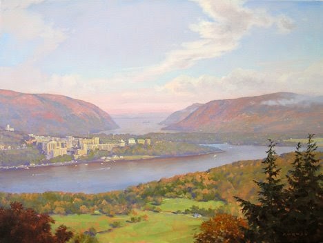
Gradation
Color gradation transitions smoothly from one to another. The shift can occur from one hue to another, or from a light color to a dark color, or from a dull color to a saturated one.
Scenes will have several systems of gradations going on at once. Usually it takes planning to convey each.
Tints
Adding white to a color raises it to a tint or a "pastel" color.
Paler ranges of colors help convey a feeling of light.
Using darker-toned colors in other parts of the painting helps for the sake of contrast.
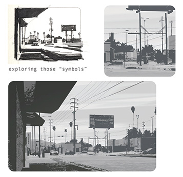
Graphic L.A. PGS 18-37
Thumbnails:
Start by finding the value PATTERN that best represents the scene, which means making design CHOICES and not just "copying."
Good design contrasts the area of visual rest with visual complexity.
Shape/design = large rhythms
Form = contours/etching/hatching
Thumbnail it out... Always explore the possibilities.
Searching for the composition should take as much exploration as "rendering" the image. Ultimately, the staging is what tells its story.
Is the design interesting and "readable" in just TWO values?
Find the lightest light and darkest dark right away, then work back to front getting values and drawing correct before moving on to the next part.


.jpg/300px-Johannes_Vermeer_-_The_lacemaker_(c.1669-1671).jpg)